Redesigning Bisleri@Doorstep for a User-Friendly and Seamless Experience
Redesigning Bisleri@Doorstep for a User-Friendly and Seamless Experience
Redesigning Bisleri@Doorstep for a User-Friendly and Seamless Experience
Redesigning Bisleri@Doorstep for a User-Friendly and Seamless Experience

Role
Role
Role
Senior UX/UI Designer
Senior UX/UI Designer
Senior UX/UI Designer
Senior UX/UI
Designer
Team
Team
Team
UX/UI Designer, PMs, Developers, QA, Client Stakeholders (Marketing, CRM, IT)
UX/UI Designer, PMs, Developers, QA, Client Stakeholders (Marketing, CRM, IT)
UX/UI Designer, PMs, Developers, QA, Client Stakeholders (Marketing, CRM, IT)
UX/UI Designer, PMs, Developers, QA, Client Stakeholders (Marketing, CRM, IT)
Platforms
Platforms
Platforms
Android, iOS
Android, iOS
Android, iOS
Android, iOS
Timeline
Timeline
Timeline
4 Months (Phase 1)
4 Months (Phase 1)
4 Months (Phase 1)
4 Months (Phase 1)
Please Note- This case study presents a high level overview of my design process. Specific details, data and sensitive information have been intentionally omitted or abstracted to respect client confidentiality. All brand assets and product visuals remain the property of their respective owners and are shown here solely for illustrative portfolio purposes.
Please Note- This case study presents a high level overview of my design process. Specific details, data and sensitive information have been intentionally omitted or abstracted to respect client confidentiality. All brand assets and product visuals remain the property of their respective owners and are shown here solely for illustrative portfolio purposes.
Problem
Problem
Problem
Problem
Bisleri’s doorstep delivery app was functional but lacked clarity, confidence, and ease of use for customers. Users struggled with long subscription flows, unclear order tracking, and limited information while deciding, which led to hesitation and drop-offs. At the same time, the business needed to increase subscriptions, improve retention, and drive wallet-based payments, while elevating the overall brand and checkout experience.
Bisleri’s doorstep delivery app was functional but lacked clarity, confidence, and ease of use for customers. Users struggled with long subscription flows, unclear order tracking, and limited information while deciding, which led to hesitation and drop-offs. At the same time, the business needed to increase subscriptions, improve retention, and drive wallet-based payments, while elevating the overall brand and checkout experience.
Bisleri’s doorstep delivery app was functional but lacked clarity, confidence, and ease of use for customers. Users struggled with long subscription flows, unclear order tracking, and limited information while deciding, which led to hesitation and drop-offs. At the same time, the business needed to increase subscriptions, improve retention, and drive wallet-based payments, while elevating the overall brand and checkout experience.
Goals
Goals
Goals
Goals
To solve these challenges, we set the following UX and product goals:
To solve these challenges, we set the following UX and product goals:
To solve these challenges, we set the following UX and product goals:
Improve clarity and confidence across the ordering and subscription flow
Improve clarity and confidence across the ordering and subscription flow
Improve clarity and confidence across the ordering and subscription flow
Simplify and reduce steps in checkout and subscription journeys
Simplify and reduce steps in checkout and subscription journeys
Simplify and reduce steps in checkout and subscription journeys
Provide transparent, real-time order tracking to keep users informed
Provide transparent, real-time order tracking to keep users informed
Provide transparent, real-time order tracking to keep users informed
Streamline payments through the Bisleri Wallet for faster repeat use
Streamline payments through the Bisleri Wallet for faster repeat use
Streamline payments through the Bisleri Wallet for faster repeat use
Enhance the visual and interaction design to reflect a modern, trustworthy brand
Enhance the visual and interaction design to reflect a modern, trustworthy brand
Enhance the visual and interaction design to reflect a modern, trustworthy brand
Solution
Solution
Solution
Solution
To address the above problems, I redesigned the experience around clarity, predictability, and speed, ensuring that users always know where they are in the journey and what comes next.
To address the above problems, I redesigned the experience around clarity, predictability, and speed, ensuring that users always know where they are in the journey and what comes next.
To address the above problems, I redesigned the experience around clarity, predictability, and speed, ensuring that users always know where they are in the journey and what comes next.


My Process
My Process
My Process
My Process
Heuristic Evaluation → User Insights → Problem Definition → IA & Flow Redesign → Hi-Fi UI → Usability Testing → Design Iterations → Developer Handoff
Heuristic Evaluation → User Insights → Problem Definition → IA & Flow Redesign → Hi-Fi UI → Usability Testing → Design Iterations → Developer Handoff
Heuristic Evaluation → User Insights → Problem Definition → IA & Flow Redesign → Hi-Fi UI → Usability Testing → Design Iterations → Developer Handoff
Let's rationalise some of the design decisions together!
Let's rationalise some of the design decisions together!
Let's rationalise some of the design decisions together!
Understanding the Workflow
Understanding the Workflow
Understanding the Workflow
Understanding the Workflow
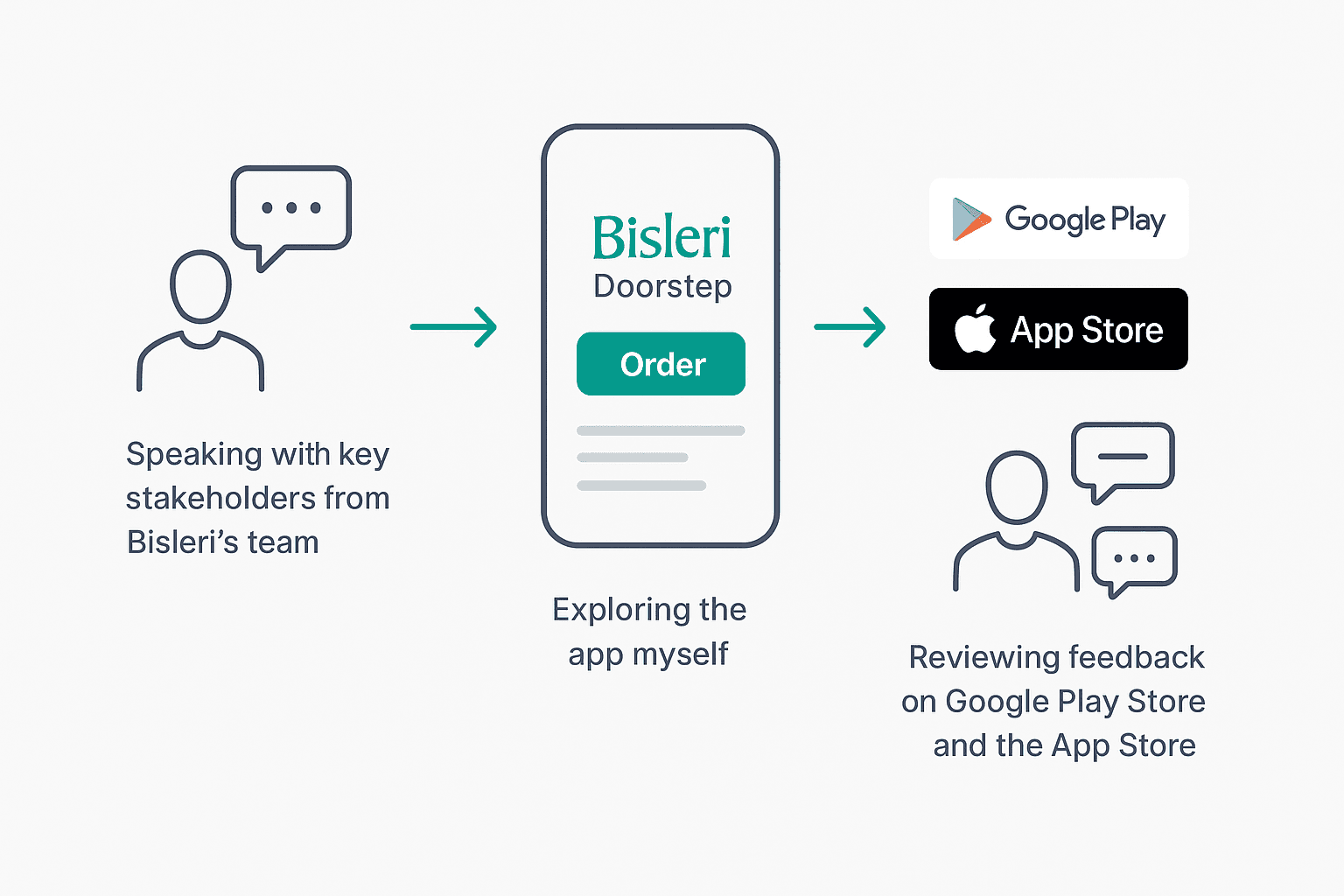
With no formal research budget, I started by speaking with key stakeholders from Bisleri’s team to get clarity on the business goals and user pain points. I then downloaded the app myself and went through the entire process, from registration and sign-up to placing orders, to experience the flow firsthand.
I also reviewed feedbacks on Google Play Store and the App Store, along with user reviews, to identify recurring issues and gaps. This combination of firsthand exploration and stakeholder
conversations helped me map the current ordering and subscription journey and pinpoint where users were facing friction.
With no formal research budget, I started by speaking with key stakeholders from Bisleri’s team to get clarity on the business goals and user pain points. I then downloaded the app myself and went through the entire process, from registration and sign-up to placing orders, to experience the flow firsthand.
I also reviewed feedbacks on Google Play Store and the App Store, along with user reviews, to identify recurring issues and gaps. This combination of firsthand exploration and stakeholder
conversations helped me map the current ordering and subscription journey and pinpoint where users were facing friction.
With no formal research budget, I started by speaking with key stakeholders from Bisleri’s team to get clarity on the business goals and user pain points. I then downloaded the app myself and went through the entire process, from registration and sign-up to placing orders, to experience the flow firsthand.
I also reviewed feedbacks on Google Play Store and the App Store, along with user reviews, to identify recurring issues and gaps. This combination of firsthand exploration and stakeholder
conversations helped me map the current ordering and subscription journey and pinpoint where users were facing friction.
With no formal research budget, I started by speaking with key stakeholders from Bisleri’s team to get clarity on the business goals and user pain points. I then downloaded the app myself and went through the entire process, from registration and sign-up to placing orders, to experience the flow firsthand.
I also reviewed feedbacks on Google Play Store and the App Store, along with user reviews, to identify recurring issues and gaps. This combination of firsthand exploration and stakeholder
conversations helped me map the current ordering and subscription journey and pinpoint where users were facing friction.
What I learned and why it mattered?
What I learned and why it mattered?
What I learned and why it mattered?
What I learned and why it mattered?
While reviewing the existing app and studying user feedbacks, one pattern stood out: people didn’t feel in control of their journey. Whether they were subscribing, re-ordering, or tracking delivery, there were too many moments of uncertainty.
While reviewing the existing app and studying user feedbacks, one pattern stood out: people didn’t feel in control of their journey. Whether they were subscribing, re-ordering, or tracking delivery, there were too many moments of uncertainty.
While reviewing the existing app and studying user feedbacks, one pattern stood out: people didn’t feel in control of their journey. Whether they were subscribing, re-ordering, or tracking delivery, there were too many moments of uncertainty.
Customers were unsure when the delivery will arrive or where to check it's status.
Customers were unsure when the delivery will arrive or where to check it's status.
The subscription setup takes too long, customers wanted something simple.
The subscription setup takes too long, customers wanted something simple.
The homepage lacked clear guidance, leaving users unsure where to start.
The homepage lacked clear guidance, leaving users unsure where to start.
Important actions are hidden, making customers to tap around unnecessarily.
Important actions are hidden, making customers to tap around
unnecessarily.
Important actions are hidden, making customers to tap around
unnecessarily.
These insights helped me define a clear direction to reduce confusion, increase clarity, and let users complete tasks with fewer steps.
These insights helped me define a clear direction to reduce confusion, increase clarity, and let users complete tasks with fewer steps.
These insights helped me define a clear direction to reduce confusion, increase clarity, and let users complete tasks with fewer steps.
Setting the foundation
Setting the foundation
Setting the foundation
Setting the foundation
I began by focusing on the core screens —> login, sign-up, and the home page, to set the visual direction and structure for the redesign.
I began by focusing on the core screens —> login, sign-up, and the home page, to set the visual direction and structure for the redesign.
I began by focusing on the core screens —> login, sign-up, and the home page, to set the visual direction and structure for the redesign.
One of the first challenges was rethinking the information hierarchy and flow without overwhelming users, while still keeping the experience familiar.
One of the first challenges was rethinking the information hierarchy and flow without overwhelming users, while still keeping the experience familiar.
One of the first challenges was rethinking the information hierarchy and flow without overwhelming users, while still keeping the experience familiar.
To guide this, I studied other leading e-commerce and subscription-based apps for layout inspiration.
To guide this, I studied other leading e-commerce and subscription-based apps for layout inspiration.
To guide this, I studied other leading e-commerce and subscription-based apps for layout inspiration.
I created multiple variations for the home and subscription flows, and after reviews with the Bisleri team, one direction was finalized as the base for Phase 1.
I created multiple variations for the home and subscription flows, and after reviews with the Bisleri team, one direction was finalized as the base for Phase 1.
I created multiple variations for the home and subscription flows, and after reviews with the Bisleri team, one direction was finalized as the base for Phase 1.
Midway through the process, the team introduced updated branding elements, including a refreshed color palette and imagery. Since I hadn’t set up a formal design system yet, I manually applied these updates across all screens, ensuring consistency and delivering the revised designs on time.
Midway through the process, the team introduced updated branding elements, including a refreshed color palette and imagery. Since I hadn’t set up a formal design system yet, I manually applied these updates across all screens, ensuring consistency and delivering the revised designs on time.
Midway through the process, the team introduced updated branding elements, including a refreshed color palette and imagery. Since I hadn’t set up a formal design system yet, I manually applied these updates across all screens, ensuring consistency and delivering the revised designs on time.
This became the perfect moment to set up a proper design system. I created styles, components, and variables in Figma, then implemented the new branding consistently across all screens to ensure a cohesive visual language.
This became the perfect moment to set up a proper design system. I created styles, components, and variables in Figma, then implemented the new branding consistently across all screens to ensure a cohesive visual language.
This became the perfect moment to set up a proper design system. I created styles, components, and variables in Figma, then implemented the new branding consistently across all screens to ensure a cohesive visual language.
Key UX and UI Decisions
Key UX and UI Decisions
Key UX and UI Decisions
Key UX and UI Decisions
While the full flow is confidential, here’s a glimpse of before-and-after screens with key improvements and design decisions.
While the full flow is confidential, here’s a glimpse of before-and-after screens with key improvements and design decisions.
While the full flow is confidential, here’s a glimpse of before-and-after screens with key improvements and design decisions.
Rebuilding the Home Screen Navigation
Rebuilding the Home Screen Navigation
Rebuilding the Home Screen Navigation


Simplifying the Subscription Flow
Simplifying the Subscription Flow
Simplifying the Subscription Flow

Creating Transparent Order Tracking
Creating Transparent Order Tracking
Creating Transparent Order Tracking

Visual Design System
Visual Design System
Visual Design System
To ensure consistency and clarity across the experience, I created a simple UI system focused on readability, hierarchy, and accessibility.
To ensure consistency and clarity across the experience, I created a simple UI system focused on readability, hierarchy, and accessibility.
To ensure consistency and clarity across the experience, I created a simple UI system focused on readability, hierarchy, and accessibility.

Collaboration & Constraints
Collaboration & Constraints
Collaboration & Constraints
Collaboration & Constraints
To keep the experience scalable and technically feasible, I collaborated closely with PMs, developers, and client teams. Together, we made decisions that balanced user experience, business priorities, and engineering effort.
Not everything could be built at once, so we prioritized the most impactful flows first (Tracking,
Subscription, Navigation) and aligned on a rollout plan for additional enhancements.
To keep the experience scalable and technically feasible, I collaborated closely with PMs, developers, and client teams. Together, we made decisions that balanced user experience, business priorities, and engineering effort.
Not everything could be built at once, so we prioritized the most impactful flows first (Tracking,
Subscription, Navigation) and aligned on a rollout plan for additional enhancements.
To keep the experience scalable and technically feasible, I collaborated closely with PMs, developers, and client teams. Together, we made decisions that balanced user experience, business priorities, and engineering effort.
Not everything could be built at once, so we prioritized the most impactful flows first (Tracking,
Subscription, Navigation) and aligned on a rollout plan for additional enhancements.
To keep the experience scalable and technically feasible, I collaborated closely with PMs, developers, and client teams. Together, we made decisions that balanced user experience, business priorities, and engineering effort.
Not everything could be built at once, so we prioritized the most impactful flows first (Tracking,
Subscription, Navigation) and aligned on a rollout plan for additional enhancements.
Outcome & Impact
Outcome & Impact
Outcome & Impact
Outcome & Impact
The redesigned experience made the journey clearer, faster, and more subscription-friendly. Users were able to complete key tasks with confidence, without second-guessing where to go or what would happen next.
The redesigned experience made the journey clearer, faster, and more subscription-friendly. Users were able to complete key tasks with confidence, without second-guessing where to go or what would happen next.
The redesigned experience made the journey clearer, faster, and more subscription-friendly. Users were able to complete key tasks with confidence, without second-guessing where to go or what would happen next.
20% reduction in drop-offs across the core flow
20% reduction in drop-offs across the core flow
20% reduction in drop-offs across the core flow
Increase in subscription sign-ups due to a shorter, guided journey
Increase in subscription sign-ups due to a shorter, guided journey
Increase in subscription sign-ups due to a shorter, guided journey
Clearer navigation that reduced confusion and support dependency
Clearer navigation that reduced confusion and support dependency
Clearer navigation that reduced confusion and support dependency
Faster task completion, especially for tracking and re-ordering
Faster task completion, especially for tracking and re-ordering
Faster task completion, especially for tracking and
re-ordering
From a business perspective, the redesign supported higher retention, better subscription adoption, and increased wallet engagement, aligning with Bisleri’s growth goals.
From a business perspective, the redesign supported higher retention, better subscription adoption, and increased wallet engagement, aligning with Bisleri’s growth goals.
From a business perspective, the redesign supported higher retention, better subscription adoption, and increased wallet engagement, aligning with Bisleri’s growth goals.
Proof that the redesign worked

Proof that the redesign worked
Proof that the redesign worked
Proof that the redesign worked
Reflection
Reflection
Reflection
Reflection
This project taught me that clarity after checkout is just as important as a smooth checkout itself. When people don’t know what’s happening next, trust breaks, even if the UI looks polished. By focusing on transparency, predictable steps, and fewer decisions per screen, I saw how much calmer and more confident users became.
If I had more time, I would have run A/B tests on alternate wallet flows, to further improve decision speed and conversion. But overall, this project reinforced something I now carry into every design: reduce uncertainty, reduce effort, and the experience will always feel better.
This project taught me that clarity after checkout is just as important as a smooth checkout itself. When people don’t know what’s happening next, trust breaks, even if the UI looks polished. By focusing on transparency, predictable steps, and fewer decisions per screen, I saw how much calmer and more confident users became.
If I had more time, I would have run A/B tests on alternate wallet flows, to further improve decision speed and conversion. But overall, this project reinforced something I now carry into every design: reduce uncertainty, reduce effort, and the experience will always feel better.
This project taught me that clarity after checkout is just as important as a smooth checkout itself. When people don’t know what’s happening next, trust breaks, even if the UI looks polished. By focusing on transparency, predictable steps, and fewer decisions per screen, I saw how much calmer and more confident users became.
If I had more time, I would have run A/B tests on alternate wallet flows, to further improve decision speed and conversion. But overall, this project reinforced something I now carry into every design: reduce uncertainty, reduce effort, and the experience will always feel better.